
The next time you look up at the night sky, take a close look at some of the brightest and closest stars: Sirius, Alpha Centauri A, and Betelgeuse. You may notice that Sirius is bluish white, Alpha Centauri A is a bit yellow like our Sun, and Betelgeuse orange-red. What does that color mean?
Your eyes are stellar thermometers. Every time you look into the night sky and notice the color of a star, you have taken the temperature of that distant, massive ball of cosmic gas. Sirius is close to 10,000K, Alpha Centauri A is close to 6000K, and Betelgeuse 3500K. This kind of temperature measurement is only possible through the phenomenon of blackbody radiation.
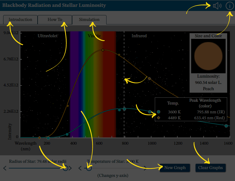
An ideal blackbody absorbs all the radiation that fall on it (hence the name), but more importantly for us, all blackbodies also radiate a continuous spectrum with a particular shape. The spectrum has the same shape for all blackbodies: a particular smooth curve with a peak, but the wavelength of the peak depends on the temperature of the blackbody. The overall luminosity depends on the area of the emitting surface. Objects such as stars and planets are not perfect blackbodies, but are close enough that we can use the following properties to make measurements of stars:
- The spectrum they emit does not depend on their composition. The spectrum of any blackbody at the same temperature (T) is the same.
- The energy emitted is σT4 per second per sq. m. where σ is a constant.
- The peak wavelength is inversely proportional to temperature (Wien’s Law).
The peak wavelength emitted by the blackbody doesn't tell the whole story of its color, since your eye will pick up a mix of colors in the visible band. Star colors mainly depend on how much red light there is compared to blue. Hot stars, having more blue than red, therefore appear blue.
The brightness or luminosity of a star is very sensitive to both its temperature and its size (area). If one star is twice as hot as another of the same size, it emits 16 times more energy. If two stars have the same temperature, one that’s twice the radius of the other will emit 4 times the energy.
When exploring blackbody curves in the interactive, note that even though the curves change for different settings, they all share a common aspect when we use wavelength for the horizontal axis – a steep rise and a shallow fall off.
Your goal is to explore the impact of a star’s temperature and radius on the way it appears in the sky and on the shape of its emission spectrum. How do the peak emitted wavelength, the luminosity, and visible color of the star change with size and temperature? Is the color of a star what you’d expect based on the intensity of its output across the range of UV, visible, and infrared light?
You will be creating graphs of the intensity of light emitted (y-axis) at each wavelength (x-axis) by stars at a given temperature. Note that the scale of the y-axis changes as you choose a first star-temperature to graph. If you add a new graph, the scale of the y-axis locks based on the first graph so you can compare the intensities of the two curves. Look out for the characteristic emission-spectrum curve of blackbody radiation: a steep rise and a shallower fall off.
There are a few control options:
- Set the temperature of a star.
- Set the radius of the star, which impacts size, color, and luminosity.
Note that changing the radius will not change the intensity displayed on the graph ( or the height of the graph), as the intensity is measured per second per square meter. The luminosity, displayed under the image of the current star, takes the surface area of the star into account and will change. Two stars at the same temperature emit radiation with the same intensity from each patch of surface; the total amount of radiation emitted (luminosity) depends on intensity and area of the surface.
- Add a new graph at a different temperature using the y-axis intensity range locked from the first star. You can compare up to four graphs at once.
- Clear all graphs and redraw your latest graph with the intensity range that shows its curve best.
- To review the data for any star you have graphed, click on—or tab to—the shape icon associated with that graph in the temp & peak wavelength table. This will update the size and color box with the information for that particular star.Screen reader users: This information is available in the temp & peak wavelength table.
- If the sound is on, activate an icon in the temp & peak wavelength table to hear tones that represent the shape of the curve. (You can activate the icon by clicking on it or tabbing to it then hitting the enter or space keys.)
Note: The color descriptions of each star in this interactive are subjective and differences in brightness are not always reflected in the color description.
Your goal is to explore how a star’s temperature and size impact its overall color, peak emitted wavelength, emission curve, and luminosity.
This simulation is divided into 4 regions: First, the title banner with the audio on/off and info buttons. Second, the navigation options. Third, the controls region where you can set the star’s temperature and radius and graph additional stars. Fourth, the data region where you will find details about the graphs you’ve created. Visit the How To tab for details.
| Graph number | Temp. | Peak Wavelength (color) | Peak Wavelength Intensity | Violet Intensity | Red Intensity | Star Color | Luminosity |
|---|---|---|---|---|---|---|---|
| 10201 K | 113.7 nm (UV) | 4.7E14 | 3.9E14 | 1.1E14 | Blue-Grey | 4.02 solar L | |
| 10201 K | 113.7 nm (UV) | 4.7E14 | 3.9E14 | 1.1E14 | Blue-Grey | 4.02 solar L | |
| 10201 K | 113.7 nm (UV) | 4.7E14 | 3.9E14 | 1.1E14 | Blue-Grey | 4.02 solar L | |
| 10201 K | 113.7 nm (UV) | 4.7E14 | 3.9E14 | 1.1E14 | Blue-Grey | 4.02 solar L |
Audio: Turn sounds off or on. See How To tab for details on what the sounds indicate.
Information: Reopen this overview screen.
Introduction tab contains background information about the subject of the simulation.
How To tab contains detailed information about how to use the simulation.
Simulation tab contains the simulation.
Radius of Star: Adjust the value using the left and right arrows or by dragging the circle.
Temperature of Star: Adjust the value using the left and right arrows or by dragging the circle. Also changes the scale of the y-axis.
Use New Graph to plot an additional star to compare with any already plotted stars. Note: The new plot will use the y-axis range already set.
Use Clear Graphs to remove all plotted stars and start again.
Listen to Current Graph: Use the icons in the data table to listen to the slope of a previously-plotted star.
Peak Wavelength Indicator: A dotted line indicates the location of the peak wavelength for the most recently graphed star.
